Topics
Projects
3 Panel Brochure
This tutorial is not designed as a step by step start to finish brochure project, but rather as an introduction to the tools and planning required to create a brochure. The focus will be on:
- Two powerful Writer tools; Page columns and Frames and illustrate how and why they are used for creating a brochure.
- Establishing the need to pre-plan a project like a brochure.
A brochure consists of two pages; one page represents the Inside and one page represents the Outside. Designing the Inside panels of the brochure is fairly straight forward, it's not much different than working on a standard page. However designing the Outside page of the brochure demands more preparation. A brochure is a project that requires pre-planning:
- Type of fold - Tri-fold or Accordion fold
- Creating the 3 Panel Layout structure - usually created with Columns and/or Frames
- Working in reverse - since the brochure is printed double-sided on one sheet of paper this requires the Outside panel to be designed in reverse to the Inside panel.
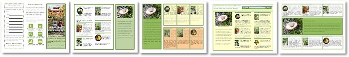
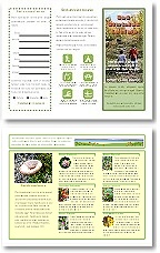
An information brochure is the easiest type of brochure to make because there is less concern with dynamic design and more focus on displaying content. Therefore the examples shown in this tutorial will be based on an information brochure, the kind that might be picked up for hiking in a Provincial Park or campground that describes the Flora of the region.
It will be assumed that the user has some experience with Writer including text formatting, styles and working with pictures wrapping options. The contents of this tutorial are:
- Type of Fold
- Guiding Structures
- Page columns
- Frames
- The Outside Panels - Designing in Reverse
- Putting it Together
Type of Fold
The two most common ways to fold a 3 panel brochure is with either the Tri-fold, also known as a "Gate" fold, or the Accordion fold, also known as a "Z" fold. The design of the brochure is often dependant on the type of fold chosen.
Tri-fold
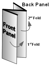
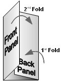 A tri-fold, or Gate fold brochure has the Inside right panel and Inside left panels folding over the Inside centre panel, with the right panel folded inward first, then the left panel folder over the right panel as shown here. The reverse side of the Inside right panel is the Outside back panel and the reverse side of the Inside left panel is the Front panel (cover). The term Gate fold comes from the way the brochure is opened; both the left panel (Front) and right panel (back) open up like swinging gates to reveal the inside of the brochure.
Because this type of fold reveals all three Inside panels at once, content and graphics can be made to have more "punch" by expanding them across multiple panels which really makes the information jump out at the reader. In other words, the three Inside panels can act as one large panel or one double and one single panel.
 Because the Tri-fold brochure opens up like a gate (hence Gate fold) to reveal all the panels at once, this can make for a more dynamic layout by allowing the design to expand across multiple panels.
Technically the panels are not folded in equal parts, the first fold, which is the Back panel is folder slight narrower (about 1/16" less) than the Front Panel. If this doesn't happen the panels will "bow" outward as it will not lay flat over each other.
Design in Reverse
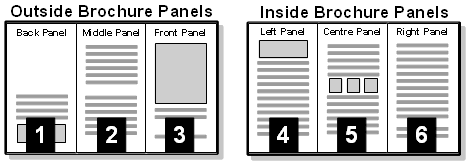
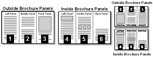
The tricky part to this type of fold is to remember that the Outside panel is designed in reverse to the Inside. In this illustration both sides of the brochure are laid out as they would be for printing. Each panel has been numbered for clarity. Notice in the Outside layout that the Front panel (3) is actually on the right side and the Back panel (2) is on the left side.
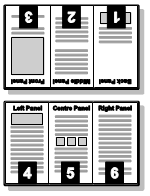 This can confuse a first time designer because designing the Inside of the brochure is a straight forward, left to right, 3 column design. The confusion stems from the fact that the brochure is printed double-sided; one side is the Outside and the other is the Inside of the brochure. When panel 6 (Inside right panel) is folded over it reveals panel 1 (Back panel). When panel 4 is folded over, it reveals panel 3 (Front panel which is the cover).
Another way to picture this is to imagine printing each side of the brochure on a separate sheet of paper and then gluing their backs together to create a double-sided brochure. In this illustration both pages are properly laid out ready to have their backs glued together. You can clearly see that Panel 3 (Front panel) will be on the other side of Panel 4 and that Panel 1 (Back panel) will be on the other side of Panel 6. It should be clearer now to understand why the Front and Back panels are placed in reverse to the Inside panels.
To properly fold this brochure, Panel 6 is folded slightly shorter over the Centre panel than Panel 4 can fold over it flat. If both panels are folded evenly there will be a bellowing out of the panels as they cut into each other.
Accordion Fold
 An Accordion fold or "Z" fold refers to the way the panels fold in a "Z" pattern over each other as shown here. An Accordion folded brochure can often contain many panels hence the "Accordion" fold.
One of the main layout differences in this brochure is that the Front and Back panels are actually on different sides of the brochure. CD booklets often are designed as Accordion folds so that they fold neatly into the CD case and can expand with many panels of content. Because the back panel is part of the brochure Inside, it reduces the Inside design to only two panels. Therefore an Accordion folded brochure is generally used for content heavy information with each panel often relaying separate information.
Because the back panel stands out on its own in this type of fold, it is often used a mailer, fill out form or check list that can be easily separated from the brochure without removing important content from the brochure. Unlike the Tri-fold brochure there are no overlapping panels therefore all panels are folded in equal amounts.
 The layout of both the Inside and Outside pages are shown here. Note that the Back Panel is actually part of the Inside of the brochure.
Guiding Structures
In this tutorial the focus will be on a Tri-fold brochure. After the fold style is chosen, laying out the 3 panels is the next step. This step is easy because the the brochure design is based on columns and once the columns are inserted, each column will act as one panel. Therefore the columns will act as both the design structure and content containers.
Fold Lines
When creating a basic 3 column brochure its a always a good idea to add column spacing between each column to separate the columns. Generally the brochure's fold lines are in the column spaces so when folded the text doesn't get trapped in the fold lines. (Of course this doesn't apply if the design is spanning across multiple panels). Its also a good idea to determine where the fold lines will be so you can tell if text will get caught in the fold lines. Unfortunately Writer does not support the use of Drawing Guides that can can be placed on the page to represent the fold lines so it may be necessary to actually draw the fold lines on each page and delete them before printing (only Impress and Draw support Drawing Guides). However, to keep things simple, the focus in this tutorial will be on creating the three column layout structure without being concerned with the fold lines. Ignoring the fold lines is fairly common practise anyway's when using a word processor to create brochures.
Fold Line Measurements
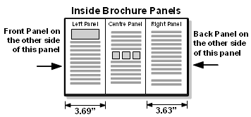 However if you want the accuracy in the fold lines the common width measurements used for the Tri-fold brochure fold lines are:
- larger outside fold is 3.69" (Front panel)
- smaller inside fold 3.63" (Back panel)
The numbers are rounded out but are close enough. Remember if you make both folds the exact same size then the panels won't lay perfectly flat and will slightly bulge outward. This can make it harder to stack a large pile of brochures.
Paper Fold Template
You can make a fold template from a plain piece of paper (assuming its the same size as the brochure). Measure both panels as shown above and fold both panels as accurately as possible with a nice sharp crease (use the edge of a pen to run over the crease to make it nice and flat. Now use this as guide for the brochure. Folding a brochure against the template can be a slow process but only need to fold a few brochures to see where the fold lines will line up in the brochure. Once you have the fold lines established you can discard the template. Remember its the inside fold that is important, and as long as the inside fold doesn't cut into the outside fold everything will be fine, even if the outside fold is made smaller the brochure will still lay flat.
Column Panels
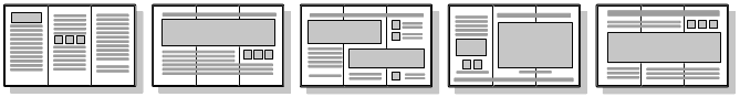
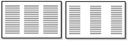
The easiest way to create a brochure is to base it on columns. Once the columns are created each column will act as one panel of the brochure, thereby providing both the structure for the brochure and the containers to hold the content. There are three ways to create the columns in Writer:
- Create columns with the Page column command.
- Create columns using the Frame command.
- Use a combination of Page columns and Frames.
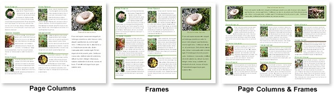
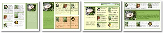
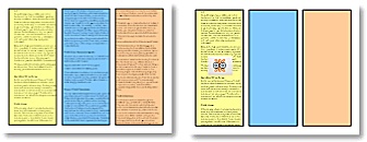
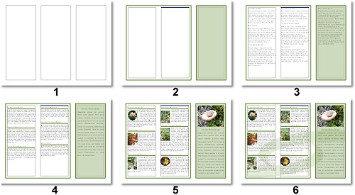
This illustration shows the Inside page of a brochure using the three different methods for creating columns. Frames provide better layout control but require more planning and effort. A combination of both methods can also be used.
You can also create a brochure using Text boxes. But Text boxes are very different from Page columns and Frames. Text boxes do not behave as text containers in the way Frames so, but act more like simple text holders similar to the Drawing shapes. Like the Drawing shape, they have no picture wrapping capabilities nor can they be divided into columns. Text boxes can be used in conjunction with Page columns and Frames for small things like "pull quotes" but as a layout structure they are better left for programs designed for their use like Impress or Draw or for single page Writer projects like a Poster.
Page Columns
![]() Page Columns can be inserted through the FORMAT menu (FORMAT -> COLUMNS). They can also be inserted with the Columns button on the Standard toolbar if that button has been added to the toolbar (by default the button is not on the toolbar but should be added is using columns a lot). Either method will open the Columns dialogue box as shown here. Columns can be applied to the whole page or just to a selection of text. When columns are applied to a selection of text a Section Break is automatically created around the text to convert them to columns. In the case of a brochure the Columns are applied to the page.
Page Columns can be inserted through the FORMAT menu (FORMAT -> COLUMNS). They can also be inserted with the Columns button on the Standard toolbar if that button has been added to the toolbar (by default the button is not on the toolbar but should be added is using columns a lot). Either method will open the Columns dialogue box as shown here. Columns can be applied to the whole page or just to a selection of text. When columns are applied to a selection of text a Section Break is automatically created around the text to convert them to columns. In the case of a brochure the Columns are applied to the page.
When inserting Columns the Columns dialogue box open as shown. In this example three columns have been selected:
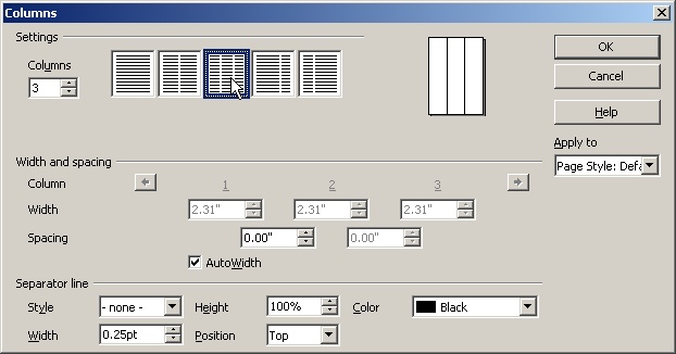
- Settings:
- Columns - Choose the number of columns by either selecting one the column buttons (1, 2 or 3 columns) or by using the spin dial to spin the number of columns (maximum number of columns is 99). In this example three columns have been selected
- Width and Spacing:
 Columns - Displays the number of columns selected. The two arrows represent the Previous and Next buttons, meaning that if a lot of columns are created this buttons will be needed to cycle through the columns.
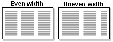 Width -
  When the AutoWidth is Checked all the columns are the same width. If the AutoWidth is Unchecked each column's width can be set manually. This means that the you can choose to make some columns wider/narrower than other columns.
- Spacing - The margin spacing between each column. The spacing is equal for all columns if AutoWidth is Checked. If AutoWidth is Unchecked, spacing can be different for each column.
- Separator Line:
(Vertical line between each column that acts to separate the columns)
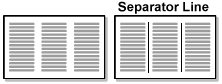 Style - Sets the line style (solid or dashed),
 - Height - The height of the line measured as a percentage of the height of the column.
- Color - Sets the colour of the line
- Width - Sets the width (thickness) of the line
- Position - Positions the line either at the Top, Centered, or Bottom of the column if the line is less than 100%.
Unfortunately there is no way to add a background colour to just one column (to make that panel stand out). To add colour to the columns you need to apply it to the page, which means the whole text boundary area of the page is coloured. It is the same with borders as borders are applied to the whole text boundary area and not around the individual columns.
Working with Page column Content
Column Spacing
 Column spacing can be used as design element in a brochure. Modern brochure tend to use smaller fonts and larger column spacing to spread the columns further apart for a breezy, uncluttered look. Column spacing can also be used to push the columns apart so that content doesn't get trapped in the fold lines. For basic columns about .3" is a good starting point.
Text Flow
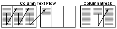 Text flows from one column to the next automatically. As with a regular page, when the columns page is full of text a new page is created and the columns continue on the new page. There is very little control in directing how the text flows from one column to the next. It's important to control the flow of text because you don't want the text to flow from the first page of the brochure to the second page as it probably won't read the way you expect because of the way the brochure is folded. Also the Inside and Outside of the brochure generally contain different content and you don't want content from one side spilling over to the other side unless you can control where it goes.
Column Breaks
 About the only control there is in directing the text flow is with a Column Break: INSERT-> MANUAL BREAK-> COLUMN BREAK. With a Column Break you can force text from the middle of a column to start at the top of the next column. Column breaks are necessary for controlling the flow of text in a brochure. Column Breaks are visible as a thin black line on top of the column. As a result you will always know which columns have breaks by looking out for this line. You may have to look closely, because it gets harder to see when the column is filled with text.
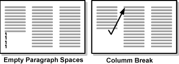 If, for example, you want to move some text from the 1st column to the 2nd column you don't want to push that text over to the next column by using the ENTER key because that creates empty paragraphs spaces (indicated by the paragraph marks). Empty paragraphs can be a problem in columns because they usually end up at the top of a column. The better solution is to force the text over to the next column with a clean Column Break, which moves the text to the next column without using empty paragraph spaces.
Text Wrapping
 Text will wrap around an image in columns in the same manner it does on a regular page. Columns have an advantage in that an image can be inserted between the columns and the text will flow over all sides of the image as shown in this illustration. Keep in mind that every image placed takes up space which means that the text that would have occupied that space gets pushed downward. The more images used the less room there is for text.
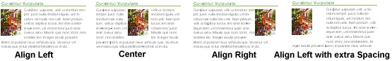
Text wraps around an image in Columns the same way it does on a plain page. You will still need to add a small amount of Spacing to push the text away from the image.
Circular Images
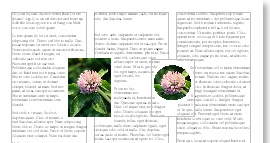 A circular shaped image looks really good in a brochure, especially when it is placed between two columns. You can change the square/rectangular shape of an image into a circular shape (or other kinds of shapes) by following this tutorial in the Impress section: Setting Up the Picture Shape. You can use either Impress or Draw to create the circular image and then copy and paste it into the brochure. To properly wrap text around the image:
- Set the Wrap to Page Wrap.
- Add a small amount of space between the image and the text by right clicking on the image to open the Context menu and choose:
WRAP -> EDIT -> Spacing; Left, Right, Top, Bottom.
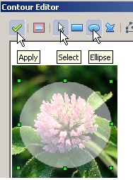 A faster way to create a circular image is to create a circular Contour wrap in Writer:
- Select the rectangular/square image.
- Right click for the Context menu and choose WRAP -> EDIT CONTOUR (don't use the Contour option itself as it won't work the way you expect).
- The Contour Editor box will open up as show here (only part on the Contour Editor is show).
- Select the Ellipse tool and draw an ellipse or circle (SHIFT for circle shape) around the part of the image you wish to display.
- Use the Select tool, if necessary, to stretch or reduce the shape by dragging the Selection Handles.
- Click the Apply button to apply the Contour wrap.
- If you wish to edit the contour, right click for the Context menu and once again select the WRAP -> EDIT CONTOUR.
- To add more spacing around the circular image open the Picture menu:
Context menu -> PICTURE -> WRAP -> SPACING.
A drawback to this method is that if you try to apply a border around the image, the border will actually go around the original rectangular/square shape not the circular shape.
Styles
 Use Paragraph Styles to control the majority of formatting in the brochure as you would in a document. This will ensure consistent formatting through the brochure. For the most part the two major formatting components are Headings and Body text. Having them covered by styles means most of the formatting is instantly done. For a refresher on Writer's styles see Quick Formatting with Writer Styles.
A simple way to separate items in a column is by modify a Heading style so that it incorporates a top or bottom border as part of its formatting. The border will run the length of the column and act as a separator line and can clearly mark the separations of that item from the next item as shown here. If adding the border to the top of Heading make sure to add some top border spacing to push the text away from the border line to make the heading easier to read. The border line can be a different colour than the heading and the border's width and style (solid, dashed or double line) can be adjusted.
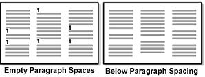 Avoid using the ENTER key to create empty spaces between paragraphs. Empty paragraph spaces are always problematic, particularly in columns. They get moved along with the paragraphs and often end up on top of a column making the tops of the columns unbalanced as shown here. To avoid this problem don't create empty paragraphs with the ENTER key but instead build extra Below space into the paragraph style. With the below space built into the paragraph style its not possible to have an empty paragraph space at the top of a column because there are no empty paragraphs created.
![]() To add BELOW spacing for the paragraphs:
To add BELOW spacing for the paragraphs:
PARAGRAPH -> INDENTS & SPACING -> SPACING -> BELOW PARAGRAPH.
You can start by adding 20% to the current font size (if using a 10pt font add 2pts for a total of 12pts BELOW spacing). From there add or reduce the point size till your happy with the spacing. Keep in mind that Writer uses Inches (or Centimetres) by default for text spacing. However most users are more familiar measuring text in Points because text size is always measured in Points. To override the Inches (or Centimetres) to Points:
- Clear the inches value in the Below paragraph spin box.
- Type the Point value and add the letters "pt" after the value (without the parenthesis).
- Writer will convert the Point value to inches automatically and create the Below paragraph spacing.
Hyphenation
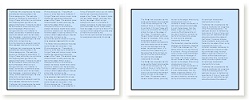
Not everyone is a fan of Hyphenation but it can be useful when applied to text in columns. By default Hyphenation is turned off. Without Hyphenation the right edge of the text boundary often gets what is commonly referred to as a "ragged" edge, meaning that the lines of text vary in length when compared to the right edge of the column. This is most noticeable in columns because columns are narrow and contain less less words per line of text.
In the illustration below the same paragraph is shown using two common text alignments: Align Left and Justified.
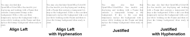
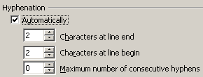 In the Align Left paragraph the "ragged" edge is very obvious. In the Justified paragraph there are large spaces between certain words making the paragraph look awkward. With Hyphenation turned on both paragraphs smooth out their right edges. Hyphenation is a paragraph property and is found under the TEXT FLOW tab: PARAGRAPH -> TEXT FLOW -> HYPHENATION. Hyphenation can be applied to individual paragraphs or to the Paragraph Style. The default Hyphenation settings are fine and will ensure that consecutive lines aren't hyphenated. Even if you don't like to use Hyphenation you may still find it useful for those really awkward, unbalanced looking paragraph that pops up here and there.
Frames
Frames are bit of a combination of both Text Boxes and Page columns. They are similar to Text boxes in that a Frame can be stretched any size and can be dragged anywhere on the page. Both Text boxes and Frames can have their own Background fill and borders. If the Frame or text box is smaller than the page, the page text can wrap around them. A Pull Quote would be an example of how a small Frame or Text box could be used on a page.
But Frames are more akin to Page columns because like Page columns, Frames can act as both structure and content holder. Like Page columns, a Frame can be divided into Columns with similar properties as Page columns. Both text flow and picture wrapping is the same as it is in Page columns. Because Frame columns behave the same way as Page columns you will still need to insert Column Breaks to push content from column in the frame into the next column. A border applied to a frame is only applied to the outside of the Frame and not around the individual columns.
Creating a Tri-panel brochure with Frames allows for more flexibility in design than just Page columns. At the simplest level a full page Frame divided into 3 columns will behave very similar to Page columns. However, because Frames acts as both structure and content container, multiple Frames can be used and arranged differently to provide variations in design not possible with just Page columns. Whereas Page columns are always vertical, Frames can be created in rows across the page and the rows can still be divided into columns. Multiple Frames will always provide more flexibility in the brochure design than Page columns. Frames can also be used in conjunction with Page columns.
When using Frames as the major design component instead of Page columns, its important to create the brochure's two pages first before any Frames are placed on the page. Therefore a Manual Page break will be need to create the second page. If you set up the first page with Frames and then try to insert a Page break you may find that a bit difficult due to the Frame covering the page's paragraph mark. A Page break is a Page property not a Frame property.
 Multiple Frames can allow each Frame to be divided into columns independent of any other Frame and each can have its own colour and border properties. Note that Frames can be also created into rows but still follow a 3 vertical column layout.
Frames are inserted through the INSERT menu: INSERT -> FRAMES. The Frames Dialogue box contains some of the same properties found in the Page and the Picture dialogue boxes. Unlike Page columns which are a Page property and are fixed, a Frame needs to be inserted, scaled and positioned on a page. Since the Frame also acts as the page structure it is important to set it at a fixed height and width and to lock it into position so it can't be accidentally moved.
Frame Properties
Type Tab
 The Type tab is the most important tab for setting up the Frames as a layout structure.
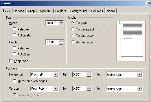
In this example the page setup is Letter size (81/2 X 11) set to Landscape with a half inch margin all around. The options for a full page Frame are shown here. By default, under the Height section the Autosize will be checked. This is useful if creating Pull Quotes or small Frame items but a disadvantage when using Frames as a layout structure. Makes sure this is Unchecked as shown.
This is the breakdown for these options:
- Size:
- Width: 10.00" (the page is 11" wide in Landscape mode with half inch margins; 11 - .5 - .5 = 10"
- Height: 7.50" (the page is 8.5" tall in landscape mode with half inch margins; 8.5 - .5 - .5 = 7.5"
- Position:
- Horizontal: From Left by .50" to Entire page; This basically means the horizontal measurement is taken from the left edge of the page and since there is a .5" left margin then a half inch from the left is required to place the frame exactly on the left margin.
- Vertical: From Top by .50" to Entire page; This basically means that the vertical measurement is taken from the top edge of the page and since there is a .5" top margin then a half inch from the top places the Frame right on the top margin.
Because its important to match the exact Horizontal and Vertical position of the Frame to the margins (text boundary box), the From left and the From top are chosen because they are the only Position options that allow you to type a number in the field. The other Position options are pre-set.
The reason the Entire page option is chosen for both the From Left and From top is because we want the precise measurements taken from the Left and Top of the page. In other words we are fitting the Frame to the page and the measurements that are chosen will automatically place it over the Text boundary area. Its always easier and more precise to take exact measurements from the left and top edge of the page.
It is also important to ensure that under the Anchor option that the Anchor the Frame to the Page is selected. When an object is Anchored to a page any outside flowing content, like text, will move around it and therefore not be able to push it out of position.
Locking the Frame Position
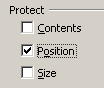 Since the Frame acts as both structure and content container its important that the Frame (or Frames if using multiple Frames) be locked so they can't be accidentally moved out of position. The Frame's position is locked through the OPTIONS tab: OPTIONS -> PROTECT -> POSITION.
 Do not lock the SIZE, if you do the text Overflow indicator may not show up. The text Overflow indicator (represented as a Red Triangle on the bottom right corner of the frame) appears when the Frame contains more text than can be displayed. The text Overflow indicator will appear in this brochure because the Height's Autosize is turned off, meaning the Frame's height will not to automatically adjust to accommodate the extra text. We don't want the frame to resize because its height needs to be fixed.
Columns tab
![]() The Columns tab is identical to the Page columns tab so all the property settings are the same. The difference is that the columns are applied to the Frame instead of the Page.
The Columns tab is identical to the Page columns tab so all the property settings are the same. The difference is that the columns are applied to the Frame instead of the Page.
Column spacing can be used as design element in a brochure. Modern brochure tend to use smaller fonts and larger column spacing to spread the columns further apart for a breezy, uncluttered look. Column spacing can also be used to push the columns apart so that content doesn't get trapped in the fold lines. For basic columns between .2" - .3" is a good starting point.
Wrap Tab
The Wrap tab is similar to the Wrap tab in the Picture dialogue box. This tab is used for text wrapping around the frame such as Pull Quotes. Or for placing a Frame row over columns. For a full page Frame the setting can be set to NONE (SETTINGS -> NONE)
Border Tab
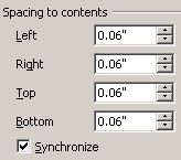
 The Border tab properties are the same as the Border tab properties in the Picture dialogue box. The Spacing to Contents setting is important as it is used to push content away from the Frame's edge when a border or a background fill is applied. A spacing of about .2" is usually sufficient (depending on the size of the font). Un checking the Synchronize options allows for spacing to be adjusted independently for each side.
Background Tab
There are only two fill options for the background of the frame: Color and Graphic. Only solid colours are available. However the colour can be made lighter with the Transparency spin box. By default the Frames have a white fill so that anything placed behind it (e.g. a watermark graphic) will not show up. There's is no way to turn the fill off despite there being a NONE option. However if the Transparency is set 100%, regardless of the colour, the Frame's fill is totally transparent. The Graphic option allows for a bitmap image to be used as the background for the Frame. There is also a transparency option that will fade the Bitmap and make anything behind the Frame partially visible.
Whether printing a transparent background image or a plain transparent drop shadows OpenOffice/LibreOffice can have problems with the rasterization of the transparencies for the desktop printer. Its always a good idea when using a transparent bitmap as a background to print a draft early in the design stage to see if it actually prints. If it doesn't print the way it looks on the screen, or to your satisfaction, then try exporting it out as a PDF and then print that. Generally a PDF will handle transparencies better than OpenOffice/LibreOffice for printing. Again, test this in the early phase of designing the brochure so you don't waste your time by having to redesign the whole brochure.
Depending on how much memory the computer has you may also find that OpenOffice/LibreOffice even has trouble just displaying and working with a Frame that contains a transparent bitmap as the background. If this is the case then temporarily replace the background with a colour while working on the Frame and then insert the bitmap background when ready to print.
Working with Frame Content
Working with Frame content is the same as working with content in Page columns. See the section above: Working with Page Columns Content.
Using Multiple Frames
 Multiple Frames have the advantage of having their own individual properties independent of other Frames. This means that each Frame can have its own background colour, borders, columns and can be resized without effecting the other Frames. It's easier to create the two empty pages first (Page Break) than trying to insert a Page Break after the Frames are set up.
 Frames can be used in conjunction with Page columns to control content in specific panels of the brochure. For example a Frame can be placed over the middle Page column (middle panel) as shown here. A Column break would be necessary to push the content from the middle Page column into the last Page column (last panel). Anchoring the Frame to the Page and setting the Frame wrapping to NONE will ensure that the column text flows either before or after the Frame but not around the Frame.
Row Frames
 Frames don't always have be created as columns, they can be a mixture of columns and rows or all rows. Mixing up the Frames allows for more design options. Its always a good idea to ensure that every Frame's size and position is set and that its position is locked. A Frame can still be resized even if its position is locked.
 Frame rows can also be used in combination with Page columns but work best if placed at the top (like a header) or at the bottom (like a footer) of the Page columns. Anchoring the Frame to the Page, setting the Frame wrapping to NONE and locking its Position will ensure that the the frame doesn't move and ensure that the Column text flows either above it or below it but not around it. If the Frame isn't locked you can re-position it to see if it works better at the top or the bottom.
In this above illustration the row Frame is divided into three columns, a smaller column for each picture and wider column for the text. In this instance, placing the pictures in their own columns provides better control than trying to mess around with the picture wrapping. You would still need to add some Bottom spacing (WRAP -> SPACING -> BOTTOM) to push the Column text away from the frame.
Linking Frames
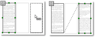
![]() Although individual Frames are independent of each other they can still be "Linked" together to allow text to flow from one independent Frame to another. Once two frames are linked text will flow from the original Frame to the linked Frame. The linking of frames is useful if you need text to continue in a column on the other side of the brochure. The difference between a linked Frame and Page columns flowing their text over onto the second page is a linked Frame can be placed anywhere on the page. A frame that is Linked to another frame can also be Unlinked to that frame, which means that the linked frame's content will flow back into the original frame. Linked Frames do not have to be on the same page.
Although individual Frames are independent of each other they can still be "Linked" together to allow text to flow from one independent Frame to another. Once two frames are linked text will flow from the original Frame to the linked Frame. The linking of frames is useful if you need text to continue in a column on the other side of the brochure. The difference between a linked Frame and Page columns flowing their text over onto the second page is a linked Frame can be placed anywhere on the page. A frame that is Linked to another frame can also be Unlinked to that frame, which means that the linked frame's content will flow back into the original frame. Linked Frames do not have to be on the same page.
To Link two frames:
 Select the first Frame with the content (you can link empty frames together and when content is added to the first Frame it will automatically overflow into the second Frame.
 Click the Link button on the Frame's toolbar (the Frame toolbar only appears when a Frame is selected)
- The Link To icon appears

- Click on an empty Frame (this Frame can't contain content, it must be empty and it must not already be linked to another Frame).
- The two Frames are now linked and a Dashed line extends from the original Frame to the linked Frame to indicate that they are linked together.
If the text overflows the linked Frame, the text Overflow indicator will appear at the bottom of that Frame (indicated by a red triangle at the bottom right corner of the overflow frame). The linked Frame can be linked to another empty Frame and the text will continue to flow into that linked frame. This can continue to the next empty Frame and so forth, even if the frame is on another page and even if the frames are pages apart.
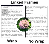 If a picture spans two linked Frames, the text will only wrap around the picture in one Frame only. Whichever Frame contains the paragraph that the picture is anchored to will be the Frame that gets the text wrapping around the image (indicated by the paragraph Anchor icon) . The other frame is ignored and the text does not wrap around that side of the image as shown here. In other words placing a picture between two linked frames does not produce the same wrapping results as placing a picture between two columns.
To Unlink two Frames:
- Select the original Frame.
 Click the Unlink button. The Unlink button only becomes active when the original Frame is selected. Selecting the second Frame that is Linked to the original frame will not display this icon. In other words you need to break the link from the original Frame to the linked Frame and not the other way around.
- The second Frame is automatically unlinked and its content flows back into the original Frame.
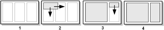
 When linked Frames are unlinked, the linking works in reverse order. If three Frames are linked together and the second Frame is unlinked from the third then the third frames contents flow back into the second frame. But if the first frame is unlinked from the second Frame then both the second and third frames contents flow back into the first frame as shown here. In other words when multiple Frames are linked the flow stops from all disconnected frames that flow from the right of that main frame.
Page Column Guides
A quick way to set up multiple Frames is to turn on the Page columns and use them as guides to position the Frames. Once the Frames are set in position the Page columns can be removed:
- Create the Page columns with column spacing and they will act as a guide for the Frames.
- Insert a Frame, size doesn't matter. Set the Height to 7.5" and assuming a 1/2" page margin, set the From top and From left to .5". Set the Anchor: to Page and then stretch the Frame over the Page column guides. If you're not too concern with exact measurements, just stretch the Frame so that it covers the Page columns as closely as possible and that should be close enough. The closer you zoom in the more exact you will be in covering the column guides. In the layout above the exact frame's width can easily be calculated by adding the width of the two columns plus the spacing between the columns (column width + column width + column spacing = Frame width).
- Insert the second Frame and set the Height to 7.5", the From top to .5" and set the Anchor: to Page. Again stretch the frame to fit the last Page column guide as closely as possible (for precision the second Frame's width is exactly the width of the Page column).
- The Frames are in now in position and Locked and the Page columns are removed.
You may find that it is helpful to insert Column Breaks into the Page columns even though they are only being used as guides. The reason for this is that Frames are defaulted to anchor to a paragraph not the Page. Even when they are set to Anchor to the Page they sometimes jump out of position particularly if multiple frames are used. This effect will be most noticeable if copying a Frame from one page of the brochure to the another page of the brochure. Without Column Breaks set in the Page columns of the other page, the copied frame will not jump to the other page.
The Outside Panels - Designing in Reverse
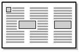
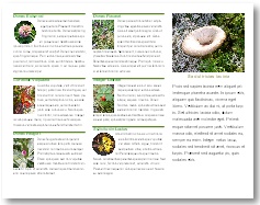
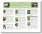
The Outside of the brochure is designed in reverse to the Inside. Even though both pages contain columns, the Inside page reads left to right like a regular page. This is not the case with the Outside panels. By default, the Tri-fold design automatically segments the Outside panels into three separate parts. Because the Front and Back panels are designed to fold over each other they can't provide the same type of linear continuity that the Inside panels create. Therefore it is common practise to take advantage of this segmentation process and provide each Outside panel with different content.
In this illustration the brochure's Outside page is shown on the left along with four possible Inside pages. Note that the Inside pages are read in the standard way from left to right. There is a visual continuity within their panels. Not so with the Outside page because the Front and Back panels are designed to fold over each other, making a clear separation of information between the two panels.
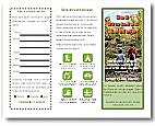 In this example of an Outside page each panel displays different content. The left panel contains a simple form or check list, the middle panel contains a Park sign legend, and the last panel acts as the cover of the brochure. Each panel encapsulates its own information and acts independently from each other. This may appear as a fairly rigid design when compared to the Inside panels, but is a good layout for a brochure created in word processor. Creating a modern, dynamic, free-flowing brochure design is best left to programs like Impress or Draw that are not constrained by the limitation of text wrapping, linear content flow and automatic page generation. This is why the rigid properties of columns and Frames work well in a word processor as both structure and content containers but are not found in either Impress or Draw.

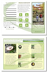
A combination of Outside and Inside brochure pages. Even though the Outside page needs to be more restricted in design compared to the Inside page, there is still room for some variation in design. Note that the Outside page is designed in reverse to the Inside page.
Designing in Reverse
 The first time you create a brochure you will probably find it difficult to get past the concept of the Outside page being designed in reverse to the Inside page as shown here. As mentioned this counterintuitive to the normal way you normally work in a word processor because content in word processor flows in a continuous linear pattern from left to right and up and down which create a continuity amongst the document's pages. To avoid confusion, a simple way to keep on track is to tri-fold a blank piece of paper and write "Cover panel" and "Back panel" on their respective folded panels (remember the Cover panel folds over the Back panel) so when you fold and unfold them and compare both sides you will have a tangible model to reference.
 Although in this tutorial the Outside page is designed to be viewed as separate panels, this is not always the case in modern brochures. Often the Outside page can be made to flow like the Inside page with all three panels working together. Usually background shapes or images are used to span the panels to tie them together. Adding background designs to both the Outside and Inside pages can help to create a more unified design.
Free flowing designs like these are easier to accomplish in programs like Impress or Draw. You can insert a free flowing design in Writer to tie panels together but keep in mind that you already dealing with Frames, columns, text wrapping, position and anchoring, so you have to establish good control over all these elements. To change the stacking order of elements you need to understand the Arrange command and to ensure the background elements don't move they should be Anchored to the page and their Position Protected.
Create your free flowing shapes either in Impress or Draw and copy and paste them into Writer. To create flowing shapes for the brochure's background you should know how to use the Drawing tools work and how to create your own custom shapes.
Putting it Together
In this example only the Inside page will be demonstrated because it has better continuous flow than the Outside page and so it will be easier to follow the steps. Also to keep the calculations simple 1/2" page margins are used along with 1/2" columns spacing.
- Letter Size Page
- Landscape mode
- I/2" margins all around
- Page columns inserted as guides; 1/2" column spacing used making each column 3" wide
- Left Frame inserted
- Height Autosize unchecked
- Frame width is the same as the two Page columns: 3+3+1/2" = 6.5"
- Frame height same as Page column's height: 7.5"
- Frame Top and Left set at 1/2" from Entire page
- Colour Border added with .2" spacing all around to push content away from all edges.
- Frame colour added and set 100% transparent because a background image will be used (Frames by default are solid white, to make them transparent any colour is added and set to 100%)
- Column break inserted in the Frame's first column so that content in the second column can be better controlled
- Anchored to Page
- Position protected
- Right Frame inserted
- Height Autosize unchecked
- Frame width is the same as a Page column's width: 3"
- Frame height same as Page column's height: 7.5"
- Frame Top set at 1/2" from Entire page
- Frame Left set at 7.5"
(1/2" left margin + two 3" column widths + two 1/2" column spacing = 1/2 + 3 +3 + 1/2 + 1/2 = 7.5) - Colour Border added with .2" spacing all around to push content away from all edges.
- Background colour added with high Transparency
- Anchored to Page
- Position protected
- Paragraph Styles created
- Paragraph style created for the Body text: font, font size, alignment and Hyphenation
- Paragraph style created for the Headings: font, font size and colour, bottom border and colour (helps to separate the content)
- Paragraph and Heading styles created for right Frame
- Images added
- Images inserted and sized to the same height and width
- Text wraps to the right of the images only (Wrapping: After image)
- Extra Right spacing added to push text away from the image
- For variety, several circular images created with Contour wrap and extra Right spacing
- Background image
- Background shape created in Draw
- Copy and pasted onto the brochure page
- Sized and placed
- Sent to Back of stacking order
- Anchored to Page
- Protected Position
Conclusion
Writer is good program to create a basic Tri-fold brochure. By using Frames and/or Page columns both the layout structures and the content containers are created. Formatting and text wrapping are handled in the same manner as they are on a regular page making working with columns fairly easy. The only real issue in designing a brochure is to understand that the Outside and Inside pages are designed in reverse because of the way the brochure is folded and to print test pages when using transparencies.
Comments or suggestions: lincpark@hotmail.com.