Topics
Projects
Tables
When organizing information into rows and columns, two tools can be used: Tabs or Tables. Tables are a better choice as they are actually made up of rows and columns of cells that alignment content naturally. Content can be aligned both vertically and horizontally in cells. Cells can be filled with a background colour and can have borders applied to them. In situations where lots of information is being organized Tables out perform Tabs in many ways.
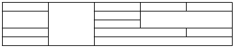
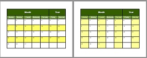
Tables are often used to create regimented row and column structures often with a Column and/or row header. An example of a regimented structure with a column header would be a calendar. Tabs can also be used to create a calendar, which on the surface, has the "appearance" of being made up of rows and columns. To illustrate some important differences on how Tabs and Tables differ when organizing information into rows and columns, a generic one month calendar, shown below, demonstrates both methods:
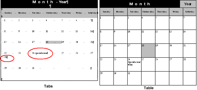
On the surface, both calendars look good and if the intention was just to print them out and write important calendar information on the printed copies then both calendars would work fine. However the most obvious difference between the two calendars is when calendar information is actually typed directly into the calendars. This is how both methods handle the text:
- Tab Calendar
- Text is typed horizontally on a single line as is normally done on a page. But in this case as the text spans across the space it encroached on the next tab stop and this tab is forced to push its text to the next tab stop and this continues resulting in the last number being forced onto the next line as shown (28). The calendar dates no longer line up (the tab stops are shown as light grey arrows between the numbers). Typing more than one or two very short words will always yield this result.
- Formatting a date to stand out with a background colour can only be applied to the single line space as shown.
- Borders can not be placed around individual dates because borders are Paragraph property and are applied to the whole paragraph.
- Table Calendar
- Every cell in a table is a unique container that holds information. Text will wrap within the cell without effecting the cells on either side. As more text is typed the cells will expand vertically downward not horizontally as is the case with tabs. Therefore small amounts of information can be typed into each cell without effecting the Calendar layout.
- Rows heights can be set numerically negating the need to use paragraph Enters to build a row height.
- Each cell can have its own background colour without effecting its neighbour.
- Borders can be applied to the whole table or to individual cells.
- Content can be aligned both vertically and horizontally in cells
Whenever information needs to be organized in rows and columns, particularly with a column and/or header row, Tables will always win out over tabs in both ease of use and functionality.
Topics covered in this tutorial
Inserting a Table
 Tables can be inserted into a document either through the Table Menu command or the Table button located on the Standard toolbar:
- Menu Command - TABLES -> INSERT -> TABLES
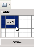
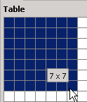
- Table Button - Clicking the Table button on the Standard toolbar opens a grid-like menu containing cells which allows you to drag over these cells to create rows and columns. As you drag over the cells an information box displays the number of columns (first number) and rows (second number) that will be created. In the example shown here a table containing 4 columns and 3 rows will be created. The MORE button at the bottom of the grid will open the same dialogue box that the INSERT -> TABLE command does.
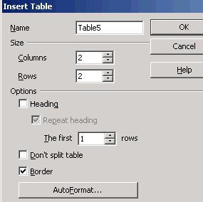
The INSERT TABLE command open the Insert Table dialogue box as shown here. The options are:
- Name - With the Navigator tool a user can jump to a specific table within a document.
- Size - Spin up or type the number of Rows/Columns needed in the table.
- Options:
- Heading - Creates a Header row for the table
- Repeat Heading - Allows the header row to be repeated if the table splits over to a another page.
- The First _ Rows - Allows for multiple rows to be Header rows.
- Don't Split Table - Tries to prevent the inserted table from splitting over to the next page.
- Border - Applies all border to the table
- AutoFormat - Allows the user to apply preformatted table options.
Deleting a Table
 The easiest way to delete a whole table is to place the cursor in one of the cells and delete it from the TABLE MENU -> DELETE -> TABLE. Just selecting the table and clicking the Delete or Backspace key will not delete the table, it will only delete the contents in the table. To delete a table with the Delete or Backspace key you need to select the table and the space above the table as shown here.
Selecting Table Properties
When a table is created its properties can be modified either through the Table Format dialogue box (TABLE -> TABLE PROPERTIES) or the Table toolbar or the right click Context menu ->TABLE.
Table Format Box
The Table Format dialogue box contains 5 tabs of options, a quick summary of the tabs are as follows:
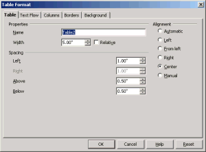 Table tab: contains options for Naming the table, setting its Width, setting its Horizontal Alignment/Spacing on the page and its Vertical Spacing from other objects.
- Text Flow tab: options for setting a Manual Break on the page for the table, allow the table to Split across to the next page, allow a row to Split across to the next page, Keep the table with the next paragraph, cerate a Header row and set the Vertical Alignment for text in the cells.
- Columns tab: the main options here are whether to adjust the Widths of the columns Proportionately or set individual column widths Manually.
- Borders tab: set Borders for rows, columns, cells or the whole table and set the border Line Style, Width and Colour. Set Spacing between the border and the cell contents and an option to add a Drop Shadow to the table.
- Background tab: applies a background Colour or Image to a cell, row or table.
Table Toolbar
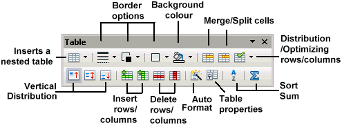 The Table toolbar only appears when the the cursor is in a table cell. It contains most of the common options that can be used in a table such as Borders, Background colour, Merging/Splitting cells, inserting/deleting rows/columns, vertical cell alignments, row/columns distribution and Autoformat. It is generally quicker and easier to use the this toolbar or the Context menu for basic table options than choosing the options from the TABLE MENU.
Context Menu
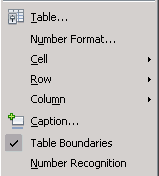
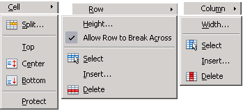 Table properties can also be accessed through the right click mouse button Context menu. The Context menu contains options found in both in the Table toolbar and the TABLE MENU. Inserting a row or column through the Context menu or Table toolbar will open the same Insert Row or Column dialogue box.
Table Mechanics
Navigating Cells
To move from cell to cell in a row:
- Use the Tab key to jump to the next cell to the right
(Note: if the text cursor is in the last cell of a table and the Tab is hit this will automatically generate a new table row) - Use the SHIFT + Tab to jump to the next cell to the left
- Use the Right/Left Arrow keys to move a cell in the direction the arrow points
- Click on a cell with the cursor
To move from cell to cell in a column:
- Use the Up/Down Arrow keys
- Click on a cell with the cursor
Cell Alignment
Content can be aligned both horizontally and vertically in a cell. Vertical alignment includes: Top, Center and Bottom of the cell. Horizontal alignments of Left, Centre and Right are controlled by the Formatting toolbar.
 The Vertical alignments can be accessed through the Table Format box via the TABLE MENU (TABLE -> TABLE PROPERTIES -> TEXT FLOW -> ALIGNMENT -> VERTICAL ALIGNMENT) or the Context menu (Cell -> Top, Centre, Bottom). They can also be selected as buttons on the Table toolbar.
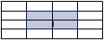
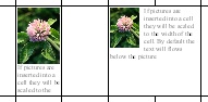
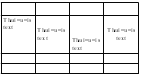 Vertical cell alignments will only be noticed if the row height is large enough to show the positioning of the content in the cell. In this illustration of a four row/four column table, the second row's height is enlarged to clearly show the vertical alignment of the content:
- 1st cell - Vertical alignment: Top
- 2nd cell - Vertical alignment: Center
- 3rd cell - Vertical alignment: Bottom
- 4th cell - Vertical and Horizontal alignment: Center
Selecting Cells
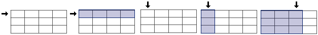
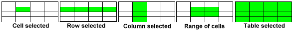
In order to change borders, background colours, cell alignments, cell formatting etc., the cells need to be selected. To select complete rows or columns use the Row/Column Selector to highlight the number of rows/columns to be selected. The Row/Column Selector appears as a black arrow; it appears to left of the table for selecting rows and it appears above the table for selecting columns as shown below. Dragging the Row Selector will highlight (select) more rows and dragging the Column Selector will highlight (select) more columns. Highlighting all cells selects the whole table.
 Cells can also be selected through the TABLE MENU command: TABLE -> SELECT -> TABLE, ROWS, COLUMNS, or CELLS. You can also select a range of cells by clicking and dragging to highlight the number of cells to be selected.
Text Selection
Text is selected in a cell the same way it is on a page:
- double clicking on a word selects the word
- triple clocking on a sentence selects the sentence
- quadruple clicking in a paragraph selects the paragraph
 Highlighting (selecting) the cell content does not select the cell. Applying a background colour when text is selected will only apply a background colour to the paragraph not the complete cell. To apply a background colour to the cell the cell must be selected. About the only way to select a single cell is through the TABLE MENU: TABLE -> SELECT -> CELL.
Images
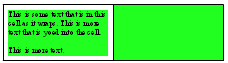
 If a large picture is inserted into a cell it will be scaled to the width of the cell. Generally this will increase the row height as shown on the right. If the picture is smaller than the cell it will be inserted Vertically to the Top and Horizontally Centred in the cell. By default the text will flow below the picture. If the cell is large enough and the image small, the text wrapping can be changed so that the text flows around the image in the cell in the same way it does on a page.
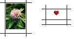
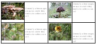 Generally, when images are use in a table, they tend to be in inserted into their own cell and text is typed into another cell. This makes it easier to control both the image and the text. Because each cell has its own horizontal and vertical alignments there is better control of the elements if they are placed in separate cells.
Images can also be placed as a background in a cell, row or table. Text flows on top of the image as the image is considered part of the cell. This is discussed in detail in the creating a Calendar section below.
Rows
Adjusting Rows Heights
Adjusting Row Heights can be done numerically through the Row Height box accessed through the Context menu or by dynamically dragging the cell borders.
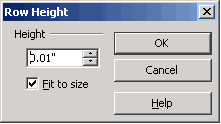
 Adjusting the Row Height can be done numerically through the Row Height box availably through the Context menu (ROW -> HEIGHT). In the Row height box the Fit To Size options is automatically checked. This ensure that regardless how small the row height is it will expand to display all the content. If this option is unchecked a row can be made smaller that the contents it holds. When this happens not all the text will be visible and the Text Overflow indicated will appear to indicate this fact as shown above.
Multiple rows can be adjusted at the same time by selecting them first and then opening the Row Height box and entering the values.
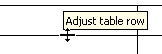
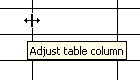
 To dynamically adjust the row height place the cursor on the top/bottom of a row border line. When the cursor is directly over the border line it will change to the Double Arrow expand icon. Generally a tool tip is also shown to indicate that the row can be adjusted. Drag the border line downward to increase the size of the row or drag it upward to decrease the size of the row. Note that this only effects the one row. The other rows stay the same height.
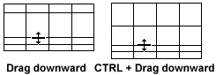
To dynamicaly increase the height of multiple rows at the same time hold down the CTRL key first then select a row's bottom border and drag downward. That row and all rows above it will increase their height together. If you drag upward with the CTRL key, that row and all the rows above it will decrease in height.
Header Row
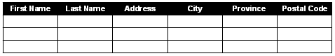 A header row is the first row of a table, that generally represents the heading names for each column. For example a table could be used to create an address list with the first row listing the category names for each column. Generally that first row would be formatted differently to make it stand out from the rest of the rows as shown here. However if there are hundreds of names then the table will split over many pages. It can be convenient to have a that header row repeated as the first row for each page of the table.
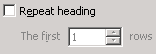
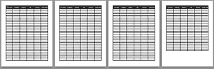 To designate the first Row to repeat: TABLE -> TABLE PROPERTIES -> TEXT FLOW -> REPEAT HEADING or Content menu -> TABLE or select the Table Property button on the Table toolbar. You can also designate more than the first row to repeat. As shown here the Header row is repeated on all pages.
Breaking a Row Across Pages
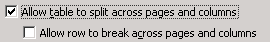 By default rows will break over pages meaning that the row will split over to the next page so that its content can continue on the next page. You can prevent the table from breaking all rows across pages or apply that option to an individual row. To prevent all rows from breaking over Uncheck the option Allow row to break across pages and columns in the TEXT FLOW tab of the TABLE PROPERTIES box.
To apply this option to an individual row:
 place the cursor in that row
- from the Context menu choose Row
- Unselect the Allow Row to Break Across page and Columns
Inserting Rows
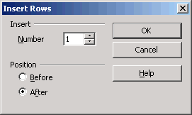 A table row can be inserted either through the TABLE MENU (TABLE -> INSERT -> ROWS), Table toolbar or the Context menu. In either case the Insert Row box appears as shown. The option include:
- The Number of Rows to be inserted; either dial up the number of rows or type the number of rows in the text field.
- Where to insert the row; Before or After the current row.
The rows will be automatically added to the table as per the options chosen in the Insert Row box. The inserted row's height will be the same height as the current row (the row whose cell contains the cursor). If the current row's height is much wider than the other rows, the new rows will be the same height as the current row.
Deleting Rows
To delete a row or a number of rows:
- place the cursor in a row for a single row or select multiple rows
- From the Context menu -> Row -> Delete
 From the Table toolbar select the Delete Row button
Columns
Adjusting Column Widths
Adjusting the Column Widths can be done numerically through the Context menu, the TABLE MENU or by dynamically dragging the cell borders.
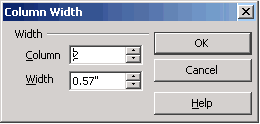 Adjusting the Column Width can be done numerically through the Column Width box available through the Context menu (COLUMN -> WIDTH). However you can only adjust one column at a time and it doesn't matter which column the cursor is in as you need to select the column number in the Column Field. A column can be made as narrow as one character wide and the text will wrap downward that way. Unlike adjusting row heights, highlighting a number of columns first and then using the Column Width box doesn't effect multiple columns as only one column is effected at time with this box. Adjusting multiple columns at once is accomplished through the TABLE MENU.
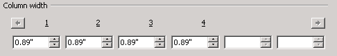 Columns widths can also be adjusted through the TABLE MENU: TABLE -> COLUMNS -> COLUMN WIDTHS. This menu allows for all columns to be adjusted at the same time. Adjusting one column wider or narrower will effect another column, generally the one to the right, to compensate. The smallest a column width can be is .02". If spinning up a column higher and the column to the right spins down to .02" then the next column to the right will start spinning down to compensate.
 To dynamically adjust a Column's Width place the cursor on the left/right cell border line. When the cursor is directly over the border line it will change to the Double Arrow expand icon. Generally a tool tip is also shown to indicate that the column can be adjusted. To increase the column's width place the arrow icon on the left cell border and drag to the left. To decrease the cell width drag to the right. The column to the left will compensate for the increase or decrease in the column's width. By default only two columns are effected; the column being expanded/reduced and the next column that compensates.
To dynamically adjust multiple columns hold down the CTRL key while dragging the left border line. The columns to the right of the selected column will expand or reduce to the same width depending on whether the selected column is expanded or reduced.
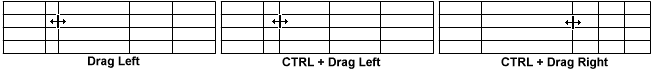
In the above illustration the third column is being adjusted:
- Dragging to the left widens the third column's width and reduces the second column's width.
- Holding down the CTRL key and dragging to the left widens all the columns to the right to the same width.
- Holding down the CTRL key and dragging to the right narrows all the columns to the right to the same width.
Inserting Columns
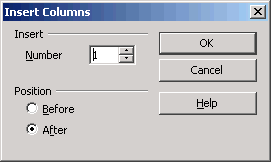 A table column can be inserted either through the TABLE MENU (TABLE -> INSERT -> COLUMNS), Table toolbar or the Context menu. In either case the Insert Column box appears as shown. The option include:
- The Number of Columns to be inserted; either dial up the number of columns or type the number of columns in the text field.
- Where to insert the column; Before or After the current column.
The columns will be automatically added to the table as per the options chosen in Insert Column box.
 Keep in mind that once a table is created, inserting columns will force the existing columns to be reduced in width to accommodate the new columns. As shown here this changes the flow of the text to a more vertical flow as the cells are reduced in width. Inserting columns can be problematic after a table has been created and content entered. This is why it is usually a good idea to properly plan out the table, particularly with respect to the number of columns needed.
If the current column (column whose cell contains the cursor) is wider than the other columns then the inserted column's width will be the same width as the current column, which in turn will reduce the width of the other columns.
Deleting Columns
To delete a column or a number of columns:
- place the cursor in a column for a single column or select multiple columns
- From the Context menu -> Column -> Delete
 From the Table toolbar select the Delete Column button
Merging Cells
 Merging cells always creates a larger cell without effecting the rest of the table. Cells can be merged horizontally, vertically or both as shown here in a 5 row/5 column table.
Sometimes when merging cells the table will be reduced in size by rows as shown below. This can happen when merged cells cell create uneven rows across the table:
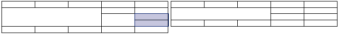
In the left table two cells in the last column are selected and about to be merged. Once those cells are merged the 4th and 5th column will contain 4 rows (with cells merged at the same horizontal level), while the 1st to 3rd columns contain only 3 rows. The table then balances itself out by removing one row.
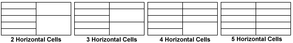
The same can happen with columns. In the following illustration a five row/two column table is shown below:
- Step 1: a five row/two column table is show with the first column containing 5 cells while the second column has all its cells merged into one cell.
- Step 2: one cell in the first column is selected and the second the second column is also selected
- Step 3: the cells are merged resulting in a one row and one column table (all cells of the first column could have been selected and the results would still be the same). The table always strives to balance the rows and in this case the only way to balance the rows for both columns is to create one row.
- Step 4: demonstrate the same technique but using a 3 column table.
- Step 5: with the addition of the extra column, the second and third columns, when merged, still collapse to one row but the row is now the height of the table.
Therefore when merging cells sometimes the results can be unpredictable when it comes to balancing the rows across the table. When merging cells doesn't yield the desired result then Splitting merged cells usually produces the desired effect.
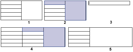
Splitting Cells
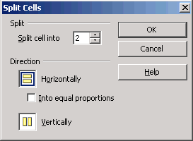 Sometimes when cells are merged you may find they need to be split up again. A cell or cells can be split Horizontally (rows) or Vertically (columns). What is unique about splitting cells is that the operation is only applied to those cells and not the rest of the table. Any cell can be Split not just merged cells.
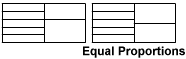 When splitting cells horizontally (rows) the cells are matched to the adjacent rows so that rows continues across. However a cell can be split evenly in half without regard to matching the adjacent rows. This is accomplished when the the Into Equal Proportions checkbox is checked. If this box is not checked then the cells are split to match the adjacent rows.
In the illustration below the second column is split horizontally into a different number of cells. The Into Equal Proportions checkbox is not checked. Note how the cells are matched across to the adjacent rows.
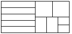 Cells can also be split Vertically into columns as in this illustration using the same five row/two column table. In this example the second column is split horizontally into two cells with the Into Equal Proportions checked. The top row is then split vertically in two cells and the bottom row is split vertically into 3 cells. This process can continue as each cell in the second column could be split horizontally (rows) independent of the other cells.
When merging cells doesn't create the desired table result, a combination of merging and splitting cells usually yields the customized row/column combination.
Borders, Background and AutoFormat
Borders
Cell borders are totally customizable and can be applied to:
- the whole table
- rows only (horizontal lines)
- columns only (vertical lines)
- cell only
- outside table border only
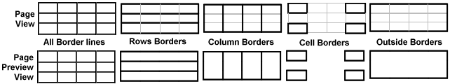
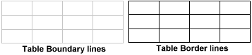 By default the Table Boundaries are turned on. These are non-printing light gray lines that border all cells and are visible when the border lines are turned off. They are used to indicate where the cells are in the table. These boundary lines can be turned off, if necessary, through the TABLE MENU, but should be left on as they are very helpful when border lines are not used. Since they are non-printing lines when viewing the table in the Page Preview window they will not be displayed.
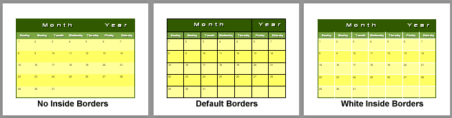
The following illustration demonstrates the different ways the borders can be applied. The tables are shown in both normal Page View and Page Preview View. As mentioned above the non-printing Table Boundary lines do not show up in the Page Preview.
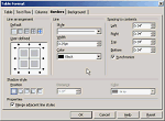 Borders can be applied either through the Table toolbar or the TABLE MENU: TABLE -> TABLE PROPERTIES -> BORDERS. The Table Format menu allows for better control over border formatting but can be confusing. It consist of three border properties:
- Line arrangement: sets the borders line arrangement, i.e. row borders, column borders and cell borders.
- Line: sets the line style, line width and colour for the borders
- Spacing to borders: sets the internal margins for the cells to push the content away from the border edges.
The Line Arrangement option can get confusing particularly if a border is already applied and you want to manually change the border. To modify borders you need to select the borders to be modified. The following illustration demonstrates selecting borders:
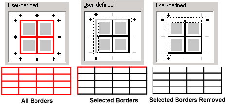
- By default All Borders are selected and when a border option is applied it is applied to all borders as shown in the User Defined "All Borders" illustration. In this example the border colour is changed to red which effects all the borders.
- To select a specific border line(s) you need to click on the border lines you wish to modify. When border lines are selected for modification they will turn gray as shown in the User Defined "Selected Borders" illustration. In this example the Top and Left borders were selected and their colours changed to red.
- To remove border lines click on the lines to be removed until the lines disappear as shown in the User Defined "Selected Borders Removed" illustration. In this example the Top and Left borders were selected and their borders removed.
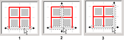 It can get tricky selecting the proper border lines. If you click too close to where two border lines intersect both those borders will be selected as shown in this illustration in step 2 and 3. To select a single border you need to click in the middle part of that line that is between two intersecting borders as shown in step 1.
Background
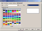 Only a solid colour or a image can be used as a background. Gradients fills aren't supported. The Background colour is found in the Table Format box which can be accessed through the TABLE MENU or the Context menu. The Table Format menu provides three background options: a cell, row or the whole table. However if a range of cells are selected choose the Cell option to apply the background colour to the range of cells.
 The Table toolbar and the Formatting toolbar both have a Background colour button but the colour will be applied to a paragraph if the cursor is in a single cell. If multiple cells are selected than the background colour will be applied to the cells. As shown below selecting a range of cells will apply the background colour to those cells.
AutoFormat
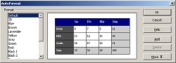
 Anyone not interested in manual formatting the table can apply automatic formatting through the AutoFormat command. The AutoFormat box can be accessed either through the Table menu, TABLE -> AUTOFORMAT or the AutoFormat button on the Table toolbar. The AutoFormat box displays a list of preformatted style on the left and when a style is selected a preview is shown in the Preview window. The MORE button extends the box with formatting options that can be Unchecked if you do not wish to apply a particular formatting. Formatting options you can control include; Number Formats, Borders, Font, Pattern and Alignment.
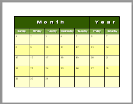
Create a Calendar Template
An easy project to create that demonstrates many of the table properties is a calendar. This project will cover these table topics:
 creating a table with a specific number of rows and columns
- adjusting row heights
- merging cells
- cell alignments
- spacing to content
- formatting backgrounds
- formatting borders
- text formatting
Its always best to determine the number of columns needed before starting a table. Inserting columns after a table has been created and content entered creates a lot of column readjustment. However with a calendar its easy to determine the number of columns need.
1. Creating the Table
 Since there are 7 days in a week, then 7 columns are needed. For the rows:
- 1 row to represent the month and year
- 1 row to represent the days of the week
- 5 rows to represent each week
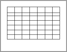
Therefore a 7 row/7 column table is needed. The table can be created with the Table button on the Standard toolbar or through the TABLE MENU -> TABLE -> INSERT -> TABLE. If you wish to add extra items like a row for notes then factor that row in.
2. Adjusting Row Heights
 Keep in mind that the table will not be wider that 7 columns, but it can be as tall as the page. The calendar can be created in Portrait or Landscape mode but it is easier to visualize it in the typical landscape mode. Therefore on an 81/2 X 11" page in Landscape mode with 1" margins this allows us lots of room for increasing the row heights so that information like Calendar Holidays and notes can be typed into the individual cells. Therefore this sample table will be 91/2" wide and as tall as 61/2". The row heights will be:
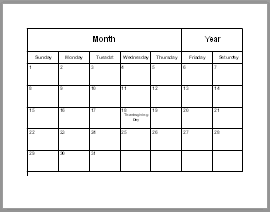
- 1st row - contains the name of the Month and the Year: 1"
- 2nd row - contained the Days of the Week: .5"
- 3rd-7th rows - represents each week and each cell will contain a calendar date: .9"
Because we want the rows that represent the weeks to be set at the same height and not adjustable so that they always remain at the same height, the option Fit to Size will be Unchecked. As a result if more content is typed into the cell than it can display at its fixed height, the Overflow icon will appear. There is some space still available at the bottom of the table to allow the first two row to have flexible heights if they need to be larger.
3. Merging Cells
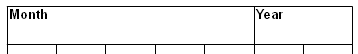 The first row will only contain the Month and the Year therefore only two cells are needed; one for the Month and one for the Year. Since the Month needs to be more prominent, the first five cells will be merged together and the last two cells will be merged together for the Year. If you wish to include an image in this top row, ensure the image is in its own cell.
4. Cell Alignments
 For the first and second row:
- The cell contents should be Vertically Centered in the cell
- The contents should also be Horizontally Centered in the cell so that it is in the direct middle of the cell.
For the rows representing the weeks:
- Typically for a calendar the Date numbers are Vertically aligned to the Top of the cell so that additional text can be added like Calendar Holidays.
- Typically for a calendar the numbers are also Horizontally aligned to the Left of the cell. Content like Calendar Holidays can still be Horizontally Centred, if desired, by entering a paragraph break after the date number.
At this point a basic template has been created. The next steps will be mostly concerned with formatting the cells and formatting the content in the cells.
Spacing to Content
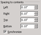 This option will be used only on the rows representing the weeks. Ideally the Date numbers should be pushed away from the edges of the borders to make them more readable. Not much spacing is needed approximately .1''. Keep in mind that spacing is an internal margin within each cell. The greater the spacing the less room there will be to type into the cell.
 If Synchronize is Unchecked the spacing for each side can be individually controlled. The Spacing to Content is available regardless if the Borders are turned on or off. Keep in mind that background colour can be applied to a cell or text. If the colour is applied to the paragraph the internal margins of the cell will be noticeable.
Formatting Backgrounds
 Formatting is a personal choice, background colours can be based on a theme, i.e., Spring colours for the months of Spring, or made with one colour. Therefore the calendar can be as colourful or plain as desired. A background colour is a good way to highlight a specific date or the Holiday dates.
Backgrounds colours and images are applied through the Table Format box: Table Format -> Background. Ensure that the "Cell" options is selected or it could be applied to the Row or the whole Table.
 A background colour can also be applied to selected cells through the Table toolbar and the Background Color button on the Standard toolbar. If the cell is not selected then the background colour will be applied to the background of the paragraph.
Background Colour
 Background colours can be applied to different rows of the table. For example the 1st and 2nd rows can have prominent colours while the rows representing the weeks can have a less prominent colour. A common colour effect used for adding interest is to alternate bands of colour for the row or columns. Each band of colour provides its own focus and adds variety and interest to the calendar.
Image Background
 Don't forget that a cell background can contain a picture and the text can still be written on top of it. However a background picture can make the text harder to read. The text may need to be formatted differently from the other cells to make it more readable. For best results the image shouldn't be too much bigger than the cell.
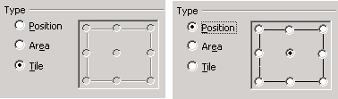
There are three options for background images:
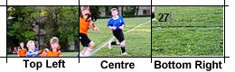 Position: if the image is bigger than the cell it can be better positioned in the background of the cell by choosing one of the eight pre-set positions on the grid. Each pre-set position on the grid represents the same area on the image. By default the Centre pre-set is selected which means that the centre of the image will be placed in the centre of the cell.
 Area: this option stretches an image if it is smaller than the cell or shrinks the image if it is larger than the cell to fit the cell. Proportions are not maintained therefore images are usually distorted. Depending on the image subject the distortion may not be that noticeable but on images of people, portraits and animals it will probably be very noticeable.
 Tile: this option only works if the image is smaller than the cell. The image will repeat itself (tile) until it fills the cell. Tiled images can be very distracting if the wrong type of image is used. The best type of image to use for a tiled background is an image the has a solid colour background with a central image so that when the image repeats the edges are not noticeable.
 If the text is hard to read over the background image, add a background colour to the paragraph text. Remember that there are two possible background colours; one for the paragraph background and one for the cell background.
Formatting Borders
By default all tables have borders already applied. The default border is .25pt in width and black in colour. This of course is just the starting point. Border lines can be thin, thick, single or double lines, solid or dashed lines. Borders can be coloured to match the table or removed completely for no visual segmentation. Making the outside border are bit wider than the inside borders encapsulates the table nicely.
Text Formatting
Formatting the text will generally be the last component. By leaving it till after the table is formatted there is some flexibility left for sizing the text. For example, if typing 3 or 4 words into the date cells the font may need to be smaller to fit into the cell without the Text Overflow icon appearing. The colour of the text may need to be changed to make it more readable if there is a cell background colour.
Some tips for text formatting:
- Consider making the Date numbers larger than any information text in the cell, i.e. Holiday names.
- Even though the Date numbers are left aligned adding an paragraph space after the number allows for the next paragraph to aligned differently if desired.
 If the text colour is a light shade over a darker background then a Character Shadow should be added to make the text standout; CHARACTER -> FONT EFFECTS -> SHADOW.
  To make large text like the "Month" and "Year" heading stand out consider Expanding the spacing between the letters: CHARACTER -> POSITION -> SPACING -> EXPANDED -> Spin the amount in points.
 The text can also be made to stand out by horizontally stretching it: CHARACTER -> POSITION -> SCALE WIDTH -> Increase the percentage over 100% to stretch the text.
Conclusion
Tables are an excellent way to organize information in a document. There is a lot of control in formatting the table and the text.
Comments or suggestions: lincpark@hotmail.com.