Topics
Drawing Shapes
 This tutorial will focus on drawing/colouring shapes that are found on the Drawing toolbar. Drawing shapes like the Block arrows can be useful for pointing out items on a slide, especially if they are animated and fly on to the slide. Most shapes contain text boxes that can be formatted in the same manner as the text layout placeholders. This means that instead of always typing text into boring rectangular text placeholders (layouts), text can be typed into a multitude of different and more dynamic shapes like circle shapes, elliptical shapes, diamond shapes, arrow shapes and many more. Shapes help to provide extra design elements that can be incorporated into the slide. Shapes can be drawn any size and filled with any of the available fill styles. All shapes can be animated.
All drawing shapes are "Vector" based objects, meaning they are not pixel based and are mathematically created having length and width and contain two properties; line and fill. In contrast a "Bitmap" is a pixel based image, meaning its made up of a grid of individual, miniscule pixels. Each pixel is a single colour. The drawing shapes can be scaled any size without losing quality while bitmaps images degrade in quality when enlarged as the grid becomes larger resulting in the pixels become visible. Vector objects are very scaleable, bitmap images are not very scaleable. Scanners, digital cameras, and Paint programs create bitmap images.
The Drawing toolbar also contains diagramming tools and Connector lines for manually creating flowcharts organizational charts. Most shapes can be connected, not just the Callouts shapes.
About Drawing Shapes
The Drawing Toolbar
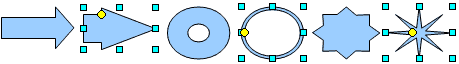
 The Drawing toolbar contains many basic drawing shapes divided into various categories. Click on the small drop down triangle by a shape button to open its panel.
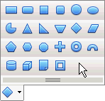
Basic Drawing Shapes
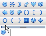
Symbol Shapes
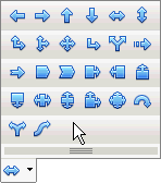
Block Arrows Shapes
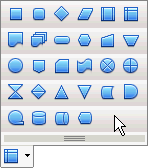
Flowchart Shapes
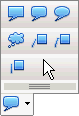
Callouts Shapes
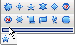
Star Shapes
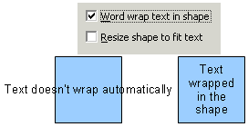
The shape text boxes don't wrap automatically
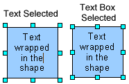
The drawing shapes contain text boxes. However, by default, the text doesn't wrap in the shape. The wrapping needs to be turned on through the TEXT menu box. The TEXT menu box can be accessed either by right-clicking on the shape and selecting Text from the Context menu or by selecting the Text from the FORMAT menu. Place a checkmark in the Word Wrap Text in Shape box, as shown above, to wrap the text into the shape. The drawing shapes are really made up of two components; the drawing shape and the text box that holds the text. Each component is selected and formatted separately. Clicking on the shape selects the shape, double clicking over the text inserts the text.
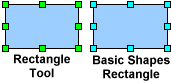 The Drawing toolbar also contains a separate Rectangle and Ellipse buttons. However, a rectangle or ellipse draw with these two tools, will not support text wrapping. If text wrapping is desired for these shapes then use the ones found under the Basic Shape panel. Impress will differentiates rectangles and ellipses drawn with these two tools by making their selection handles green instead of blue.
Drawing a Shape
All shapes are drawn basically the same way:
 Select a shape from a shape category. The pointer will turn into the Shape cursor.
- Move the Shape cursor onto the slide and click and keep the left mouse button down while while dragging diagonally to create the shape. If you just click on the slide without keeping the mouse button down the the Shape tool will turn off.
- To draw a shape proportionally, hold down the SHIFT key while drawing the shape.
 To draw a shape from the centre outwards, hold down the ALT key while drawing the shape.
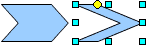
- Some shapes have yellow diamond handles that modify the shape by dragging these yellow shape handles.
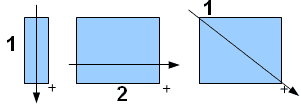 Drawing a shape can be tricky at first, its important to remember to click and hold down the left mouse button and drag to create a shape. You can either drag downwards to start the shape and then outward, i.e., drag down (length) to start the shape then to the right (width) to widen the shape, or you can drag diagonally to create width and height at the same time.
 When shapes are selected they are surrounded by 8 small blue squares called sizing handles. Placing the pointer directly over any sizing handle turns the pointer into a double-headed arrow that allows the shape to be resized larger or smaller. If you wish to keep the shape's length/width ratio proportional, hold the SHIFT key down while dragging a handle.
The shapes handles will be positioned differently depending on whether the shape is selected or the text is selected. As shown; when the cursor is in the text the handles appear outside the shape, but when the shape is selected the handles appear inside the shape.
As pointed above, some shapes have yellow shape handles that modify the shape when dragged. Several samples are shown:
 Shapes can also be rotated and skewed.
The Rotate button on the Drawing toolbar allows for both the rotation and the skew. When a shape is selected clicking the Rotate button changes the blue handles into red diamonds. Placing the pointer over any of the corner red handles turns the pointer into the rotation arrow. Placing the pointer on the middle handles changes the pointer into the skew arrows.
Shapes can also be rotated and skewed.
The Rotate button on the Drawing toolbar allows for both the rotation and the skew. When a shape is selected clicking the Rotate button changes the blue handles into red diamonds. Placing the pointer over any of the corner red handles turns the pointer into the rotation arrow. Placing the pointer on the middle handles changes the pointer into the skew arrows.
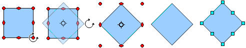 Place the Rotate arrow on any of the 4 corner diamonds to rotate the Shape. Shape rotates around the centre target circle.
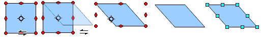 Horizontal/vertical skew icons appear when placed over the middle diamond handles. Drag in the direction of the arrows to skew
Filling the Shape
A drawing shape has two basic properties; a line and a fill. This part will focus on the fill. There are four ways to fill a shape:
- Solid fill
- Gradient fill
- Hatching fill
- Bitmap fill
The Line and Fill toolbar is a convenient way to quickly apply line and fill attributes to the shape. The four Area Fill Styles from the toolbar are show. A sample of each fill is also shown:
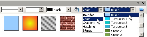
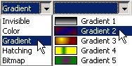
 To apply a fill, choose one of the four Fill Styles (Color, Gradient, Hatching or Bitmap) from the Fill drop down window. To open more fill options click the Area Fill button to open the large Area fill box. The Area Fill box contains 6 tabs of options:
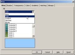 Area - Quick selection of the four Area fill styles
- Shadow - Drop shadow options
- Transparency - set transparency of colours and gradients
- Colors - solid colour options
- Gradients - gradient styles and colours
- Hatching - hatching styles and customization
- Bitmap - images that act as fills
More details on the Area fill box will be provided when discussing the options for the different fills. Only Color, Gradient and Bitmap fills will be covered as the Hatching fill is the least useful as a basic fills.
Color Fill
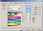 The Color Tab in the Area fill box
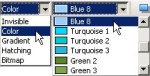 As the name suggests only solid colours are applied here. The Line and Fill toolbar displays a Standard colour list. Selecting a colour from the list applies the colour to the shape. Colours can be changed as often as desired. The Line and Fill toolbar is best used for quick fills when colour choice isn't much of an issue and the user is just looking for some basic colours. If colour is important to the presentation than the Line and Fill toolbar may be too limiting. Full access to colour options is found in the the Area fill box.
The Color tab on the large Area fill box provides access to all the solid colour option, including other colour lists and the ability to creation custom colours. All Custom colours must to be added to the current pallet before they can be used. Some of the main features from the Color tab are shown below.
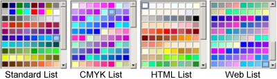 The Load Color List button provides access to 7 different colour lists, including CMYK and Web colour lists. Although the CYMK colour list is specific to printing and the Web colour list is specific to web pages, it really doesn't make too much of a difference which of the 7 colour list are chosen for onscreen presentations. The only difference that may occur is when printing a coloured presentation. Technically, the CMYK colour list should provide a closer match between onscreen colours and printed colours. However, Impress like many other basic computer programs, doesn't support colour profiles, therefore the CMYK list will probably still not provide a tight match between screen colours and print colours. Fortunately most users just create screen presentations, as such it doesn't really matter which colour list is used, as what you see on the screen is what you get.
Custom Colours
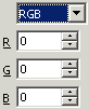
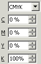 You can create/customize colours through the RGB/CMYK colour mixer. The default is RGB but the drop down menu contains the CMYK mixer also. If you know the RGB value of a colour then you can spin dial to spin the number up or down to the desired the RGB colours. If you are trying to mix your own custom colour, keep in mind that a computer uses a different colour model than printing does. In print, the three primary colours are Cyan (blue), magenta (Red) and Yellow. To create Green you would mix Cyan and Yellow. In the computer world the primary colours are Red, Green and Blue (RGB). Yellow is not a primary colour in this world, it has to mixed. To create Yellow you mix Red and Green. If you can't wrap your head around the differences in RGB colour mixing then switch the colour mode to CMYK which displays the more familiar print primary colours of Cyan, Magenta, Yellow and Black (K). Keep in mind that before using a custom colour, you need to either modify an existing colour or create/save a new one, complete with a name.
The Color Bar
The Color Bar is a toolbar consisting of the solid colours from the current list of solid colours. It is only availble in Impress and Draw but it doesn't appear in either program by default. It can be opened through the Toolbar menu: VIEW-> TOOLBARS-> COLOR BAR. When opened the Color Bar appears just above the Drawing toolbar and displays as a row of solid colours squares. This toolbar is more convenient for choosing solid colour fills than the Line and Fill toolbar:
- To choose a Fill colour click on a colour square with the Left mouse button.
- To choose a Line colour click on a colour square with the Right mouse button.
- To remove a Fill colour click in the "X" square (first square on the Color Bar)with the Left mouse button.
- To remove a Line colour click in the "X" square with the Right mouse button.
Gradient Fill
 A Gradient fill is a blending of two colours. The Line and Fill toolbar displays its Standard list of gradient fills. There are two other gradient lists to choose from; Classic and Modern. These can accessed through the Gradient Tab on the Area fill box. Selecting a gradient fill from the list applies it to the shape. You can change the gradient fill as often as desired. But to get the most out of the gradient fills, you should really create your own. The Gradients Tab in the Area fill box contains a multitude of customizable options to create eye-catching gradient fills. Gradients can not be applied to text directly. However there is a method to convert text into text-like shapes that can have a gradient fill. That topic is covered in the Custom Shapes tutorial.
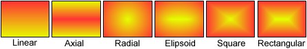
There are 6 gradient types and each has customizable options. The 6 gradient types are Linear, Axial, Radial, Ellipsoid, Square and Rectangular. The Ellipsoid gradient is basically an elongated Radial gradient and the Rectangular gradient is basically a stretched Square gradient. A sample of each is shown below:
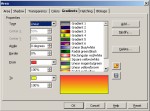 The Gradient Tab in the Area fill box
The gradient options are found under the Gradients Tab in the Area fill box. The Gradient options are:
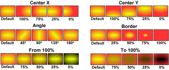
 Type: List the 6 gradients types
 Center X/Center Y: Shifts the centre of Radial, Ellipsoid, Square and Rectangular gradients
 Angle: Adjust the angle of the gradient blend up to 360 degrees. Doesn't apply to the Radial gradient.
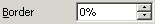 Border: Increasing the percentage allows more From colour and less To colour in the gradient
 From/To: The start and end colours of the gradient. The 100% spin slider can be ignored, as its function is to de saturate the colours, not what is usually desired in a gradient. 100% is pure colour and 0% is black.
 Preview Window: Displays the gradient
 Load Gradients List Button: Opens the directory where the Classic and Modern gradients are located. The Classic list contains a focus on monochromatic gradients such grayscale, blue, teal green, maroon, orange (salmon orange), emerald green and red.
 Save Gradient Button: Saves the customized gradient to the Gradients list.
There are far too many variables in all the gradients too discuss, therefore only the Ellipsoid gradient is demonstrated as it is one of the gradients with the most options. The main category of options are shown below:
Combining these category options will yield an endless variety of customized Ellipsoid gradients. This is true for all the gradients. If you create a great looking gradient, don't forget to save it. It will be added to the Gradients list and can be used over and over.
Bitmap Fill
 The Bitmap Fill provides an interesting alternative to the other fills. A "Bitmap" is a pixel based image, meaning its made up of individual pixels. Bitmap Fills can not be applied to text directly. However there is a method to convert text into text-like shapes that can have a Bitmap fill. That topic is covered in the Custom Shapes tutorial.
Using a Bitmap fill means the shape is actually filled with a small tiled bitmap image, meaning that a small image repeats itself horizontally and vertically until the shape is filled.
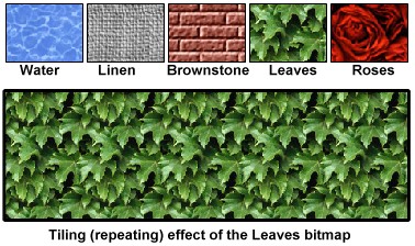 Four sample Bitmap fills are shown. The large rectangle is filled with the Leaves bitmap demonstrating that the Leaves bitmap is repeated both horizontally and vertically until it fills the rectangle. Most of the Bitmap images in the Bitmap Fill category create a seamless tile or pattern of continuous images. In other words the bitmaps are specially made so that all their edges will blend into each other for this continuous "seamless" result.
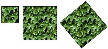 Scaling a shape with a Bitmap Fill larger or smaller doesn't scale the actual bitmap pattern, it just repeats the pattern horizontally and vertically. In this example, the square in the middle was originally the same size as the smaller square on the left. Scaling the middle square larger clearly shows that the Fill doesn't enlarge but continue to repeat the pattern both horizontally and vertically. The square on the right was rotated into a diamond shape to demonstrate that the repeating pattern does not rotate with the shape.
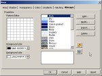
Pattern Editor
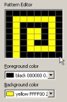
 There is also a Pattern Editor that creates a simple 2 colour pattern bitmap that can be uses as a bitmap pattern fill. The Pattern Editor consists of an 8X8 pixel grid (64 pixels) that can be coloured with either the Foreground or Background colour. Clicking on a grid pixel adds the foreground colour, clicking on it again adds the background colour. Any two colours from the colour list can be used. Any shape can be filled with the pattern. In order to use the pattern it will need to be saved, clicking the OK button to close the box will result in Impress asking you to save the pattern with a name. Once save it will appear on the bitmap list.
Enlarging or reducing the size of a shape that has a pattern does not alter the size of the pattern. Unless the Relative size is chosen, enlarging or reducing the size of of shape just extends the tilling of the pattern both horizontally and vertically to fill the shape.
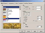
Custom Image Fill
 The Bitmap Fill box also allows you to import any picture to use as an image fill. Click the Import button to navigate to a picture. To use the picture as a fill, Impress will require you to save it by naming it so it can be added to bitmap fill list. Any drawing shape can be filled with the picture. By default the picture becomes a tiled image, meaning if the original picture is smaller than the shape it will be repeated both horizontally and vertically until it fills the shape the same as all the other bitmap fills. However, If the original image is much larger than the shape it is filling, than only the centre part of the picture will be visible.
 If the original image is larger than the shape it will be centred in, then only the central part of the original sized image is displayed as shown. If the original image is smaller than the shape then it will be tiled horizontally and vertically until it fills the shape as shown. Enlarging or reducing the shape size only effects the tilling, it does not effect the size of the image.
 Similar to the other bitmap fills, rotating a shape does not rotate the image in the shape.
Area Tab and its options.
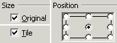 It's important to realize that the default settings in any program are basically just a "factory settings", they are not necessarily intended to be exciting or even interesting, they are just the "middle of the road" settings to get you started. It's up to the user to experiment with the options and move beyond the default settings, which often yields better results. The default setting for an image fill can easily be modified. These options are found under the AREA Tab (1st tab) in the Area Fill box. These are the default settings for the Bitmap fills:
- the image is placed in the shape at its original size
- the image is centred in the drawing shape
- the image is tiled if the shape is larger than the image.
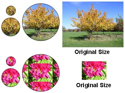
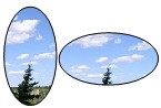
All these options are customizable and will produce a different positioning of the image inside the drawing shape. The illustration below demonstrates how to position different areas of the image into the shape. This is an important step to remember as the image, by default, is always placed in the centre of the shape. You will find that unless the image has a perfect visual centre (the main part of the image is exactly in the middle), the default setting will yield an off-centred result. In other words the main part of the image may only be partly visible. Conversely, you may wish to have a different part of the image displayed in the shape.
Image Positioning
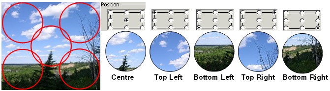
This illustrations demonstrates 5 of the 8 pre-set areas an image can be positioned within a shape.
The landscape image on the left is shown actual size and each red circle on the image corresponds to one of the 5 pre-set positions in the 5 shapes. As shown all 5 drawing shapes capture an interesting part of the image with the default centre position not necessarily displaying the most interesting part of the image. Note: changing the position of an image in the shape works best if the image is larger than the shape. Also keep in mind that enlarging the shape only exposes more of the image, the image does not enlarge with the shape. Depending on the options chosen an image fill can scale along with the shape. Those options are described further down.
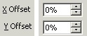 Precise control for positioning of an image in the shape can be found through the Positioning X and Y Offsets. An image can be shifted by percentages horizontally (X Offset), vertically (Y Offset) or both. The X Offset shifts the image to the left, while the Y Offset shifts the image up. If an images is shifted past its edges it will tile.
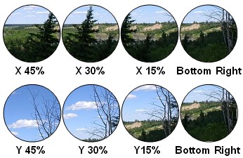 Because the X Positioning shifts left and the Y Positioning Shift up, the Bottom Right position was used as the starting point as it provided more variety in the image views. Although this example shows Offsets of 15% increments, Offsets can be done in increments as low as 1%. Both X and Y Offsets can be applied at the same time.
 Keep in mind that shifting the X/Y Offsets requires the image to be larger than the shape. For example, if the Bottom Left position was used to start and a 15% H Offset were applied, the image would shift 15% to the left resulting in the image repeating itself (tilling) in the shape. Once again it works best if the image is larger than the shape.
Several other options are available to position an image fill into a shape. Some of these options allow for the image size to be adjusted in the shape. However, unless the original image's width to height ratio is the same as the drawing shapes width to height ratio, the image will be either squeezed or stretched to fit the shape resulting in some distortion of the image.
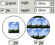 Two circle shapes with the Original option unchecked and one with Tile option checked and the other unchecked.
If the default Original (size) checkbox is unchecked, the Width and Height options become available. The default image size of 1.00cm (metric) or 1.00" (non-metric) is displayed. Both width and height can be adjusted to any size and that determines the size of the image as a fill. A perfectly square image can be adjusted without distortion as long as the height and width are adjusted the same. For rectangular images (which are most images) you would need to know the height to width ratio in order to scale the image proportionally larger or smaller. Arbitrarily adjusting the width and height measurement will distort the image as a fill.
The second option available is whether or not to tile the mage in the shape. This illustration show 2 circle shapes with the default settings of 1.00cm and with Tile option turned both on and off. The circle shape on the left has tiling turned off, therefore the 1cm image is centred in the larger circle shape. With tiling turned off the image is always centred in the shape. The circle shape on the right has the tiling turned on, therefore the 1cm shape repeats itself horizontally and vertically. With the Tile option selected the image positioning can be shifted in the same manners as all the position options described previously. Enlarging or reducing the drawing shape does not enlarge or reduce the image, as the image maintains the size it was set at.
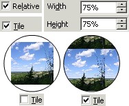 This example show a 75% Relative size and both the Tiled checked and unchecked options.
Instead of sizing an image in specific amounts, an image fill can be sized in Relative amounts. The default Relative setting for the Width and Height is 100%. However 100% does not mean that the image will be set proportional in the shape, but rather that the image width will be stretched/reduced to 100% of the shape's width and and height of the image will be stretched/reduced to 100% of the shape's height. Anything less that 100% creates a tiled image if the tile option is checked. The tile option also allows for the shifting of the position of the image in the shape using the same options described above. Having different percentages for the Width to Height setting will further distort the image fill.
However one advantage of the Relative scaling is that it does allow for the image fill to scale larger or smaller with the drawing shape scaling. In other words the image fill is always set at the same percentage regardless of the size of the shape. A 75% Relative width/height image fill is always 75% of the image.
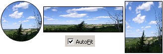 The last option for an image fill is the Autofit option. As the name implies the complete image is forced into the shape. The greater the difference between the width/height of the image and the drawing shape, the greater the width/height distortion will be. The Autofit has no options and selecting it will grey out (non selectable) all other options. However, like the Relative scaling, the image fill will scale with the drawing shape. The Autofit option works best if the image's width to height proportions are roughly the same as the drawing shape's width to height proportions.
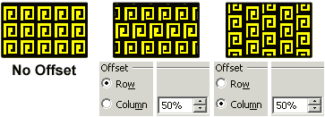 There is one more option that generally works best with a Pattern Fill. This is the Row/Column Offset. It is used with any tiled fill whether pattern or image but its usefulness is better associated with a pattern fill. Its function is to offset the row or column of the tile pattern to produce a variation to the pattern.
Conclusion
There are many drawing shapes to explore and use. Because most of the drawing shapes contain text boxes they provide an interesting way to use text. The variety of fill options provide many interesting alternative to the default fill settings.
Comments or suggestions: lincpark@hotmail.com.